Following the immense popularity of our last CSS loaders drop, we realized that developers are building increasingly diverse platforms. Whether you're coding a Web3 dApp, a cafe menu, or a fitness tracker, generic loading spinners just don't cut it anymore.
Today, we are expanding our library with 10 brand new, theme-specific pure CSS loaders. Even better, we are delivering them in a modern, highly responsive CSS Grid layout so you can immediately see how they scale and fit into card-based UI designs.
The Power of CSS Grid & JS-Less Architecture
Before we look at the loaders, take a glance at the container CSS. We utilized grid-template-columns: repeat(auto-fit, minmax(220px, 1fr));
Furthermore, every single animation you see here is executed entirely on the GPU via CSS @keyframes
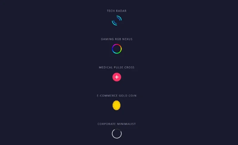
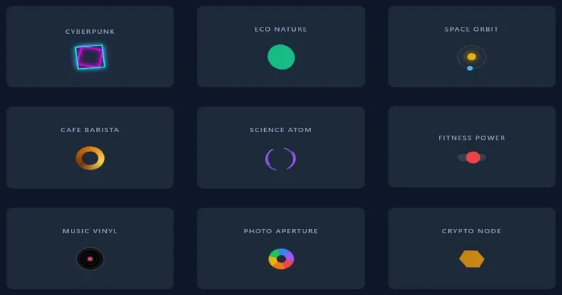
Explore the 10 Themes:
- 1. Cyberpunk: High-contrast neon borders rotating in opposite directions. Perfect for futuristic UIs or gaming sites.
- 2. Eco Nature: Utilizes advanced
border-radiusmorphing to simulate a leaf growing and turning. Great for environmental or botanical sites. - 3. Space Orbit: A classic celestial orbit using pseudo-elements, ideal for science blogs or dark-mode SaaS platforms.
- 4. Cafe Barista: Uses
conic-gradientand a CSS mask to create a perfectly poured coffee swirl. - 5. Science Atom: Three absolute-positioned rings rotating simultaneously to create a 3D atomic structure effect.
- 6. Fitness Power: A heavy pendulum sliding horizontally, giving a sense of physical weight and momentum for gym apps.
- 7. Music Vinyl: Radial gradients stacked precisely to mimic the grooves of a vinyl record.
- 8. Photo Aperture: A vibrant, multi-colored conic gradient masked into a ring, expanding and contracting like a camera lens.
- 9. Crypto Node: Uses
clip-path: polygon() - 10. Construction Gear: Thick dashed borders instantly create the illusion of industrial cog teeth grinding away.
How to Implement
Implementation is plug-and-play. If you want to use the grid showcase, copy the entire HTML and CSS blocks. If you only want a specific loader, simply copy its respective .loader-card HTML, grab the base .loader-card CSS for styling, and copy the specific animation keyframes.
All colors are defined via standard hex codes, making it incredibly easy to swap them out for your project's specific CSS variables. Happy coding, and stay tuned for more pure CSS magic from Devignitor!